
I’ve wanted to write a piece about film posters for a while. I’m sure it hasn’t escaped your notice that these days they mostly fall under the “Photoshopped Nightmare” category. As I’m the sort of adult who hangs these things on my wall and then wonders why the girls aren’t calling, it’s really disappointing that they’re mostly fucking awful. I’m not going to do a post about the tropes etc. because people have done that shit way too many times over recent years, plus if you’ve set foot in a cinema’s auditorium recently, you’re already well aware of them.
When it comes to blaming someone, people bark up the wrong tree. As is often the case, studios are to blame, not the designers. Check out this informative post that describes some of the constraints put on these people. Fair enough, it’s their actual job to respond to a remit and graphic designers are usually insanely put-upon to try and re-create some uncreative arsehole’s vague vision, but it still seems like a lot to deal with. Plus, the system in place seems directly opposed to any kind of creativity and almost custom built to produce the same grey glurge time and time again.
Much like everything else in the filmmaking process, posters are often focus grouped to death, which is a huge reason why everything looks the fucking same. Here’s the dirty secret about focus groups- they’re not the be-all and end-all. There’s years of documented problems with using focus groups, but they’re still used heavily and their findings are taken as gospel. If you haven’t seen Steven Soderbergh’s brilliant “State of Cinema” speech, I suggest you get on that. In it, he mentions the flaws of the testing system and how it affects everything to do with a movie’s release, including the poster. The thing is, people nearly always want what they’ve seen before. There’s the uber famous Henry Ford quote that springs to mind when he talked about this new fangled motor car he’d produced: “If I had asked people what they wanted, they would have said faster horses.” It’s exactly the same here.
So, the thing that made me think about this all again is that particular Black Widow poster at the top of all this. If you can’t see what’s wrong with it, you need to go outside and see what a real woman looks like (or simply look down if you happen to be a woman, obviously). The proportions are preposterous. At this point, you may be thinking “Sure, but this is just the standard Photoshop problem that plagues magazine covers and the like- nothing new here.” Well, how come both the Cap and Nick Fury posters released at the same time and done by the same people don’t look as freakish? Well, we all know the reason why, don’t we? Women are often portrayed as purely sexual objects and fetishised to a ridiculous degree. That particular Black Widow poster is made to appeal to the mouth-breathing teenage boy demographic who have no idea what an actual woman looks like and have brought themselves up on twisted pornographic caricatures of women thanks to the plethora of porn sites, video games and comic books that they indulge in. The fact that they felt they needed to give Scarlett Johansson, an almost painfully beautiful woman to begin with, a smaller waist, pixel perfect hair and zipper-busting tits is insane and speaks of problems way bigger than the simple marketing of a movie.
So why am I getting bent out of shape? Surely it’s the film that matters? Well, yeah, but movie posters are a grand tradition. Sure, the release of a poster seems more like an obligation on the studios’ part, but it still exists. The Internet and TV ads are presumably much more effective marketing tools but the poster is still hanging on in there. Shit, you need something to slap up on billboards and bus stops. To me, they represent a lot. As part of my work on this site, I have to find a corresponding poster to head my reviews and they nearly always suck. I remember seeing exciting posters for future films as a kid and just being drawn to them like a gormless moth. My parents used to hate taking me to the cinema because when it came time to leave, I would always lag behind and gawp at the colourful posters on display. In some cases, the film’s art is intrinsically linked to what I picture when I think of the film itself. Marty looking shocked at his watch whilst stepping out of his DeLorean perfectly encapsulates Back to the Future in a single image.The massive shark head coming up out of the depths to munch on a swimmer is Jaws to me. There’s no poster that I can think of it recent years that has made me want to rush out, buy it, frame it and hang it on my wall.
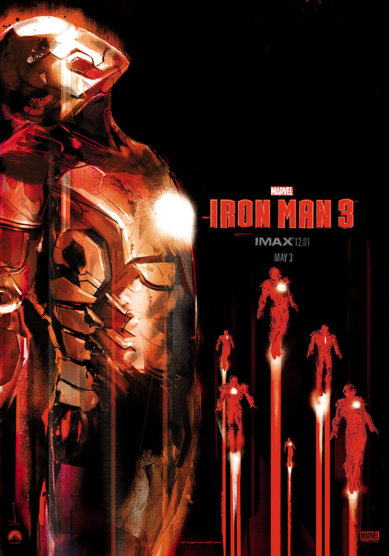
Surely the popularity of the Mondo posters and the minimalist designs shared on places like Tumblr and DeviantArt indicate that there is a market for interesting art out there? One of my favourite recent pieces is the IMAX exclusive poster for Iron Man 3 that I got from a screening, seen below. Sure, I understand why it wasn’t used for general release because it doesn’t really tell you anything about the film or feature ticket-seller Robert Downey Jr’s face or name, but shit, it’s leagues ahead of the theatrical poster where it looks like Gwyneth Paltrow has a broken neck.
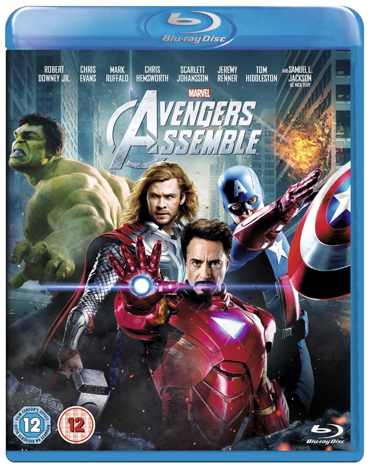
DVD/Blu-ray cover art is normally even worse. Sometimes they won’t even use their shitty theatrical art and knock together an even shittier image for the cover. As a film collector with a weird obsession with aesthetics, it really bugs me. It’s one of the main reasons I buy the increasingly popular steelbook editions of films as the cover art is usually far superior to, and way more interesting than, the normal release because it doesn’t have to cater to the sort of people who impulse buy because the cover looks like something they’ve seen before.
So what’s the solution? I have no real idea. I don’t work in the industry. However, I will ask a few questions. As film posters aren’t the most important or effective thing in a film’s promotional campaign, why can’t they be a bit more experimental? Surely now’s the time to do it as nearly every poster looks exactly the fucking same? It doesn’t make any sense to me. They’ve got fuck all to lose and a bunch of things to gain.
